Pagoda – Branding
Project Includes

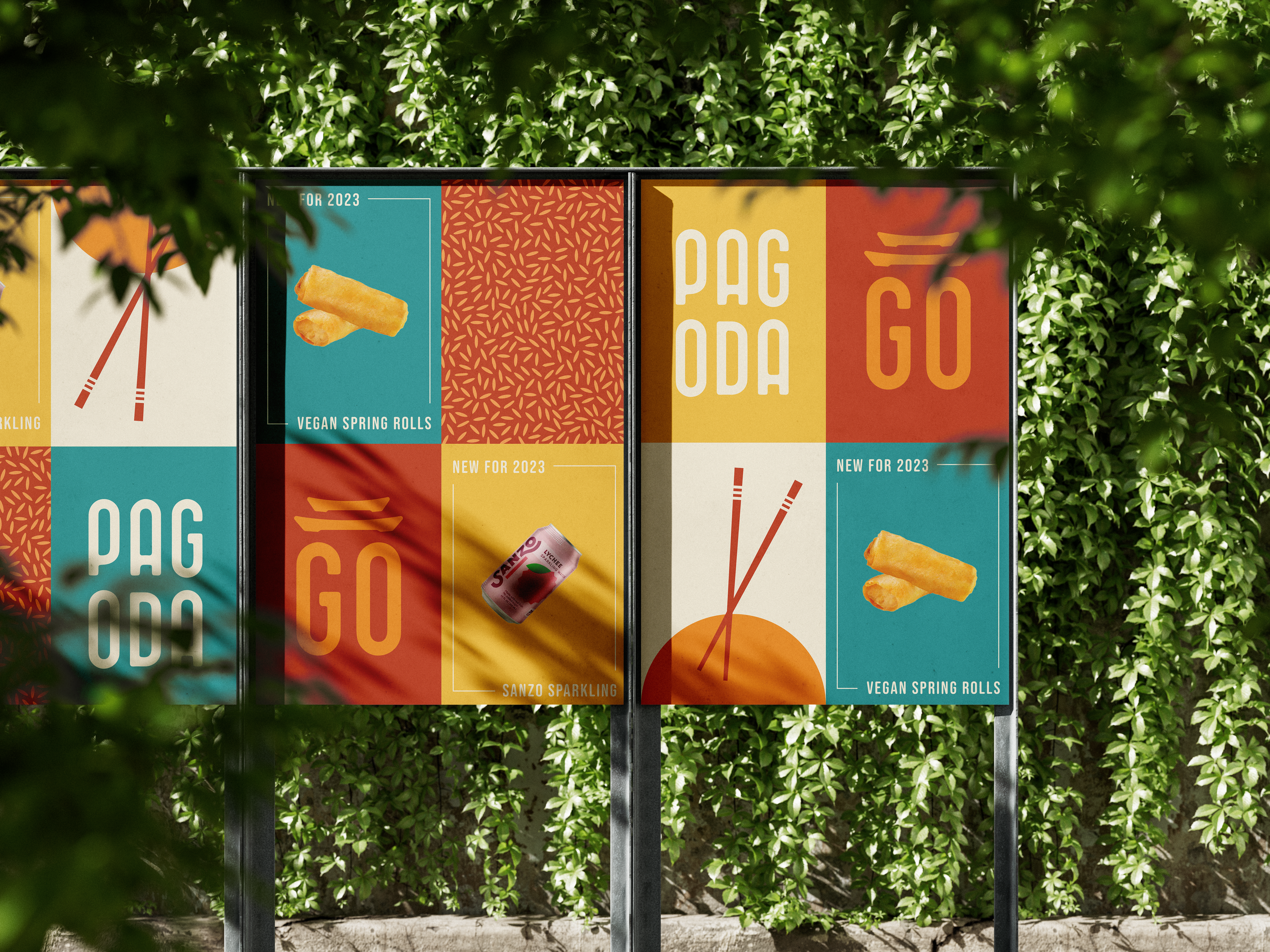
Aria has worked around the world with P.F. Chang’s for more than two decades. Given our intimate knowledge of their brand and goals, they approached us to design their new fast-casual concept, Pagoda. Alongside our interior and architecture services, we created a new brand identity. Developing branding and design concurrently creates the strongest foundation for new concepts. Our talented designers worked to imagine both a visually engaging brand and an immersive guest experience at the restaurant.
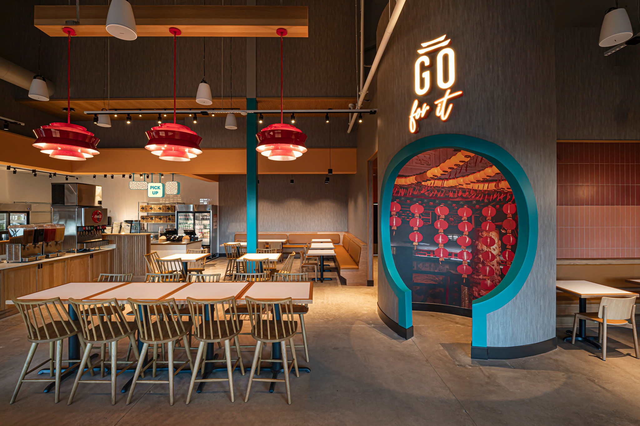
PFC’s primary goal for Pagoda was to target a younger audience with an approachable feel to Asian cuisine. Moving in a new direction from their established P.F. Chang’s China Bistro brand, our team aimed to give Pagoda a fresh, more vibrant energy to reflect the dynamic ideas behind the new concept.
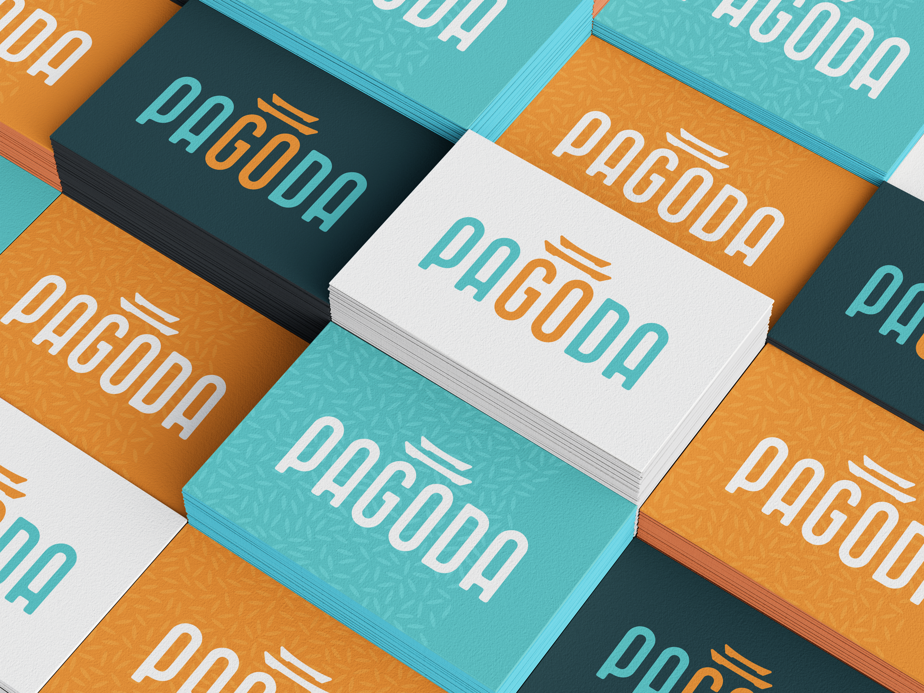
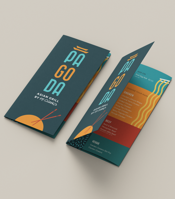
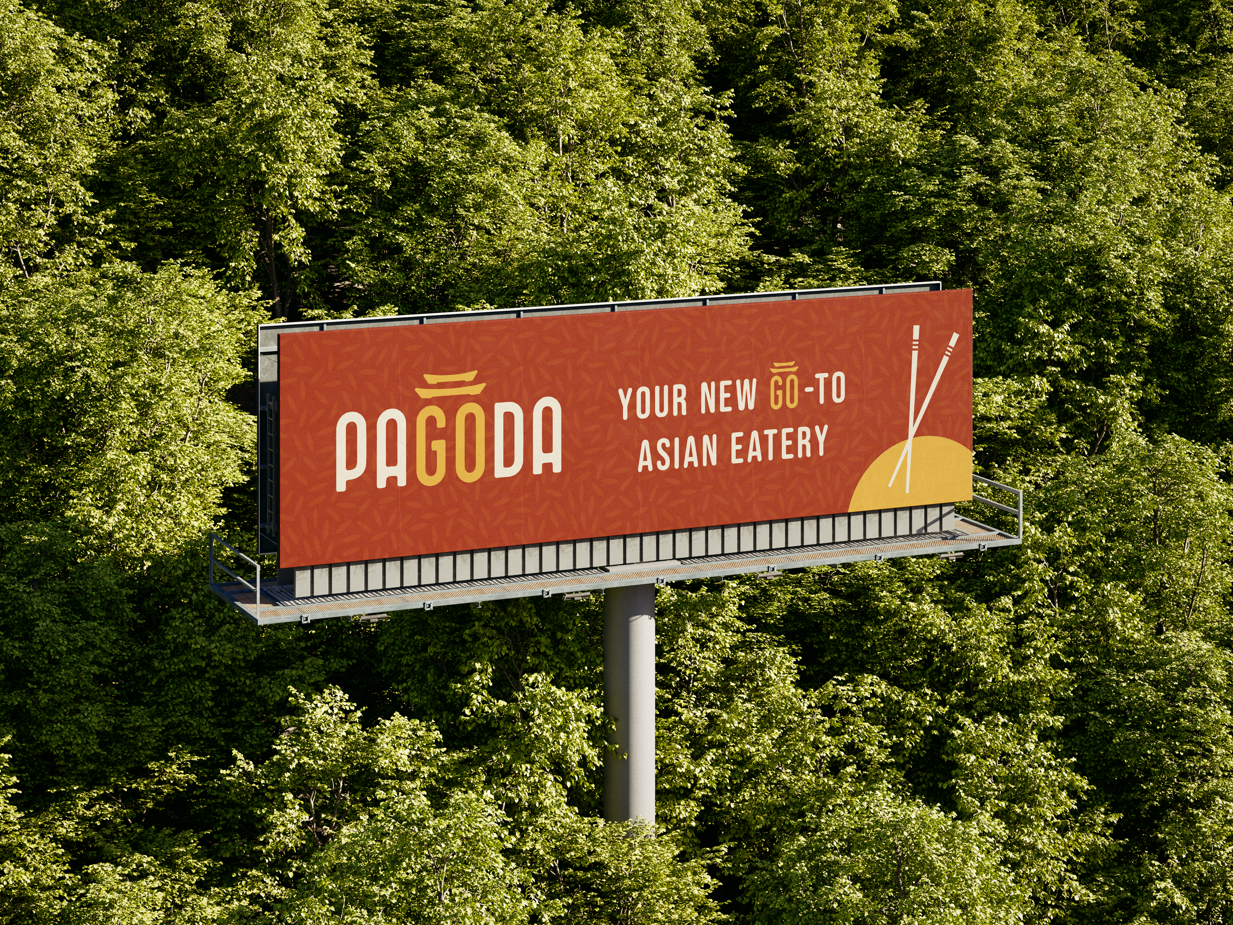
We pulled inspiration first from the name itself. Pagodas were once used as a navigational aid to travelers. We used this as the basis for the logo design, emphasizing the word “go” and highlighting the brand’s vision of taking guests on a journey to a new experience. The stacked logo evokes the monumental presence of a pagoda, giving visitors a new vantage point from which to view the world around them.
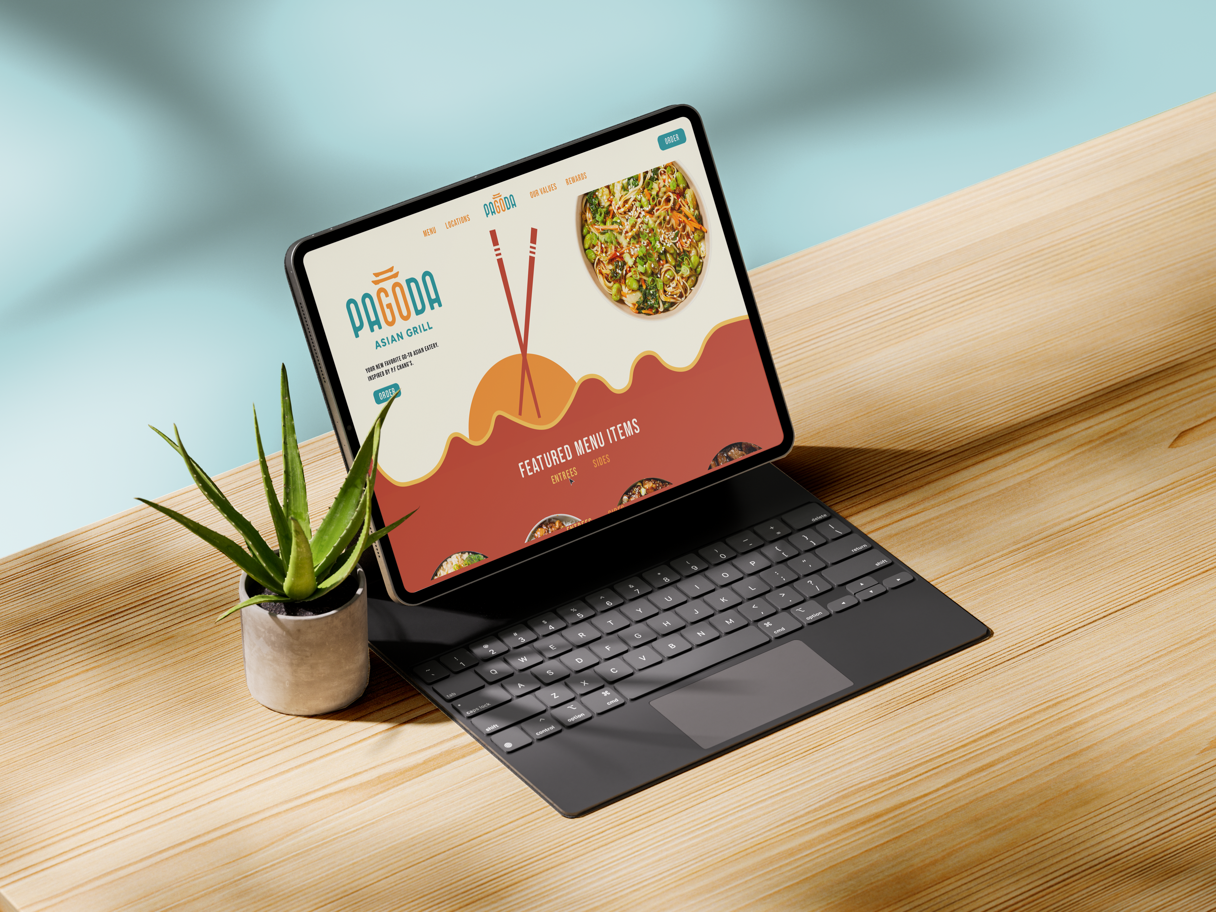
The Pagoda brand identity celebrates our first independent experiences traveling to unfamiliar places, even if that travel is solely through a dining experience. Traditional Asian motifs were reimagined as modern, playful compositions to create a brand that is approachable for the “young explorer” to engage with new cultures in a way that resonates with their fresh perspectives & interests.
*Designs are conceptual & do not represent final products by client
